

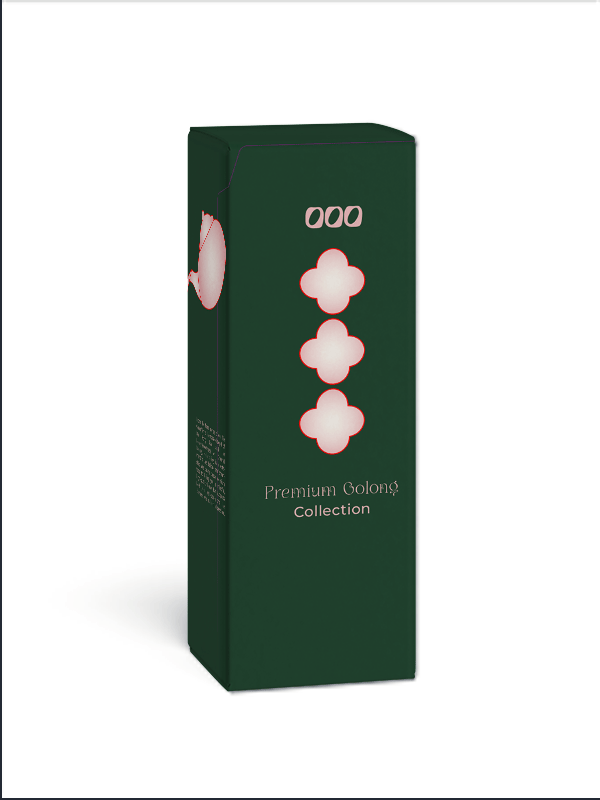
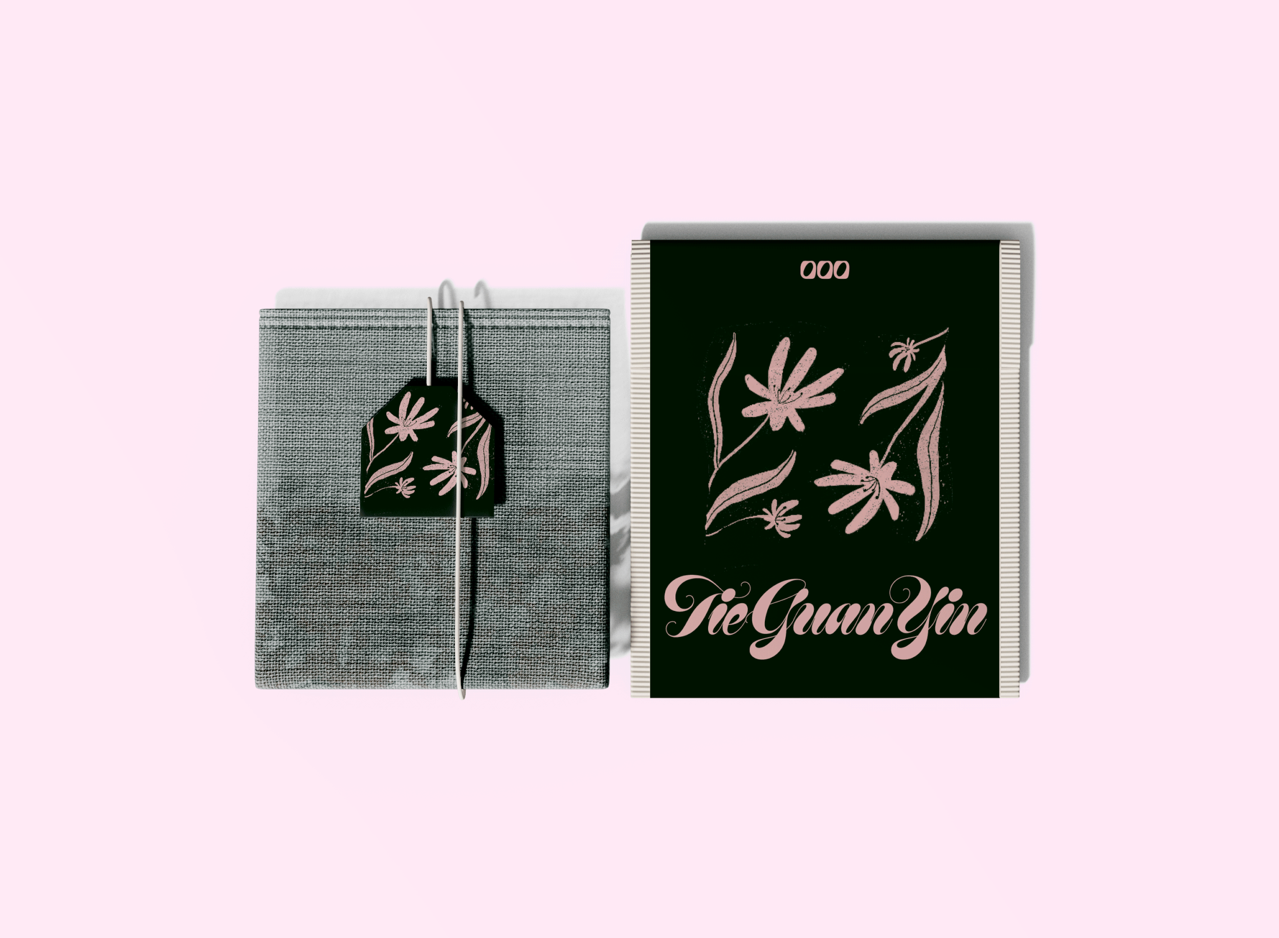
The main goal was to build a huge visual system for a premium tea brand that works perfectly everywhere, from social media to actual store shelves. The real challenge was making the brand look modern enough to stand out in a crowded market, while keeping all the complicated compliance and ingredient info looking clean and easy to read. I wanted to make sure the design language was flexible but disciplined enough to scale over time, connecting everything from corporate B2B pitch decks to the actual storefront.
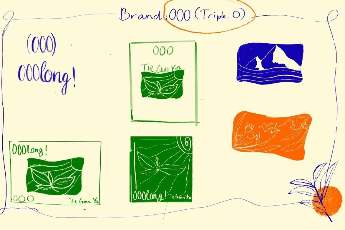
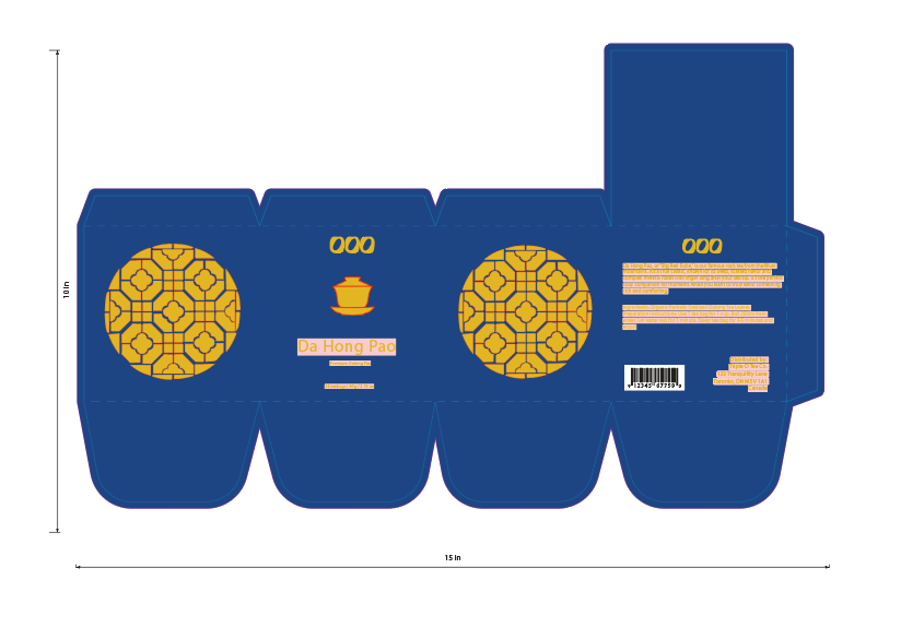
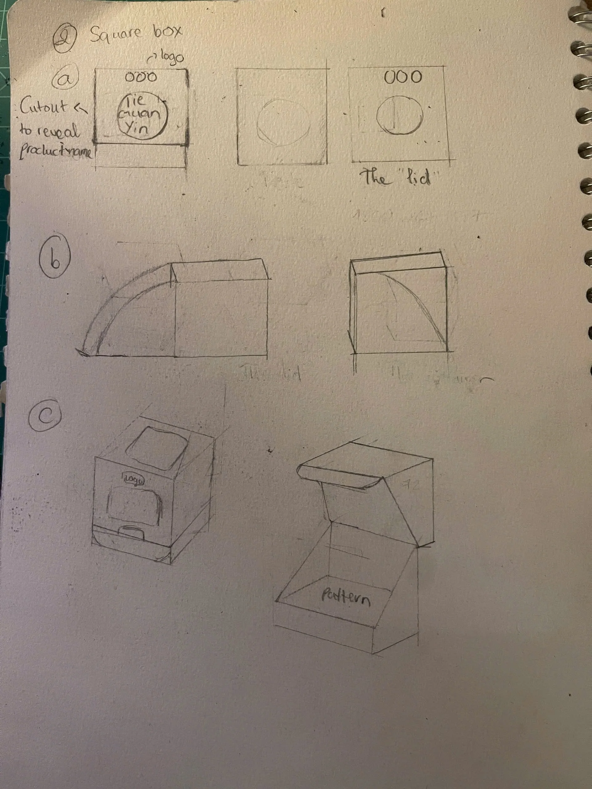
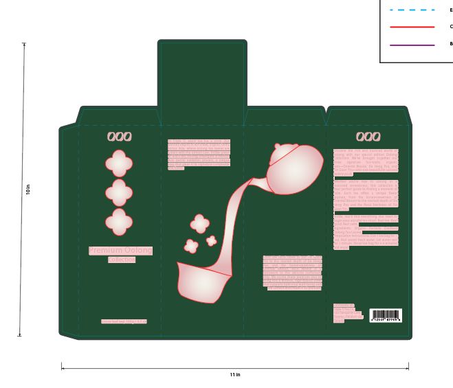
I was in charge of the visual direction: I designed a bunch of logo options, drew custom illustrations in Procreate, and wrote a full brand guideline book to keep things consistent down the road. Using Illustrator and InDesign, I prepped clean, print-ready files and built custom packaging dielines from scratch, making sure the final boxes felt high-end but were actually functional to produce. This project really showed off my "experimental plus clean" approach—proving I can take a creative concept and make it production-ready without losing its artistic edge. In the end, it wrapped up into a polished suite of marketing assets and physical packaging that completely leveled up the brand's presence.